Brand Resources
Make BTR yours.
Better in BTR was made to be shared, adapted and put to work. Use the brand on your social posts, events, recruitment materials, merch and more—and seamlessly integrate it alongside your own brand.
Logo Assets
The Better in BTR logo is designed to work alongside your company logo and messaging, and there’s no permission needed to use it. Choose the logo that best fits your application, then download the file you need.
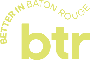
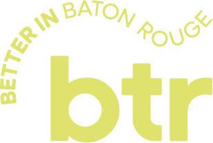
Primary Logo
Our stacked logo is the primary Better in BTR mark and the preferred choice for most applications.
Secondary Logo
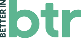
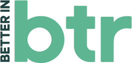
Use the vertical logo when a narrow format or limited space makes the primary logo difficult to read.




Tertiary Logo
Use the horizontal logo in wide or shallow spaces where the primary and vertical logos don't fit comfortably.



Symbol
Use the BTR symbol when space is limited or the full logo would be too small to read.
Logo Variations
More ways to rep BTR.
Our alternate logo variations offer more flexibility for unique applications. Use them when the format or creative calls for a different expression of the Better in BTR brand.
Usage Guidelines
Keep it looking better.
Better in BTR is made to be flexible. A few simple rules help keep the brand recognizable wherever it shows up.
Clearspace
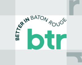
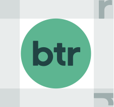
Give the logo room to breathe. Keep text, graphics and other logos outside the recommended clear space shown here.
The height of the “r” in“btr” on all sides for best legibility of the primary logo.
The do’s and dont’s
Do use the provided logo files.
Don't recreate or rebuild the logo.
Do choose the logo that fits your space.
Don't stretch, skew or rearrange individual elements.
Do give the logo room to breathe.
Don't crowd it with text, graphics or other logos.
Do keep it clear and readable.
Don't place it over busy backgrounds or add shadows, glows or effects.
Which file do I need?
.svg
Best for design and digital use. Scalable and easy to recolor.
.png
Best for everyday use. Transparent and ready for most documents and platforms.
.eps
Best for professional print production, signage and large-format applications.
Color
The brand is in your hands.
The Better in BTR logo is designed to live alongside the brands that make our region better. We encourage you to create the Better in BTR logo in your company’s colors!
Examples of the logos represented in an array of color palettes.
Keep it readable. Choose colors with enough contrast to keep every part of the logo clear.
Keep it recognizable. Change the color—not the shape, spacing, type or proportions of the logo.
Want to keep it classic?
Use the official Better in BTR palette for brand-led communications or whenever you want to rep the BTR brand.
More color, more BTR.
Our supporting palette gives you more room to play while staying within the Better in BTR brand.
Custom Lockups
Say what makes BTR better.
Write a simple phrase that connects naturally to your organization, audience, or story. Pair it with the provided Better in BTR lockup and you're ready to share.
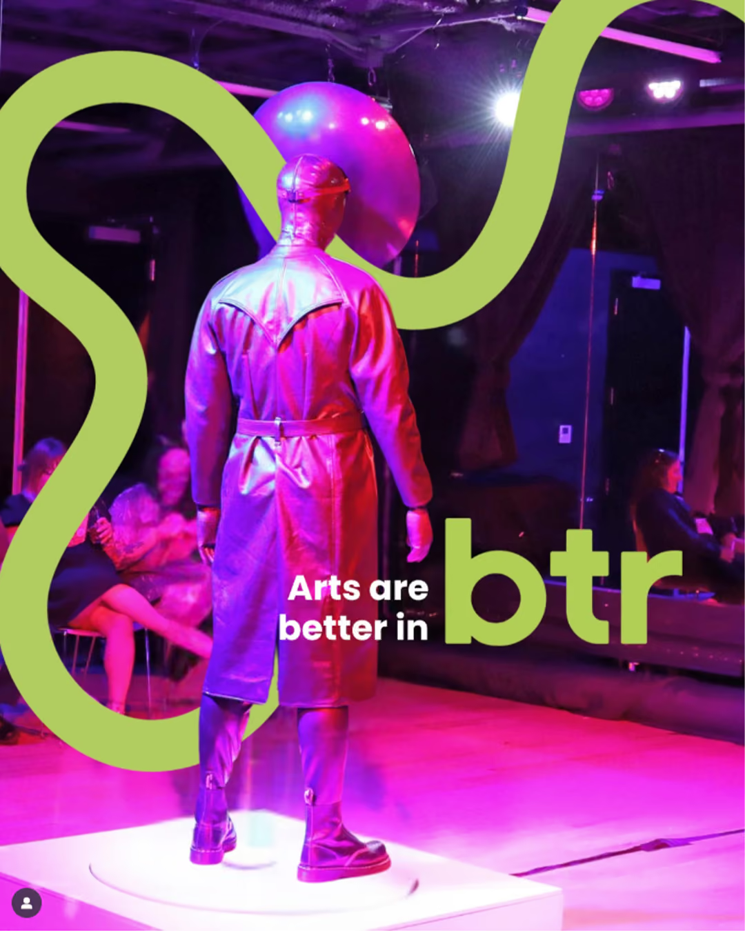
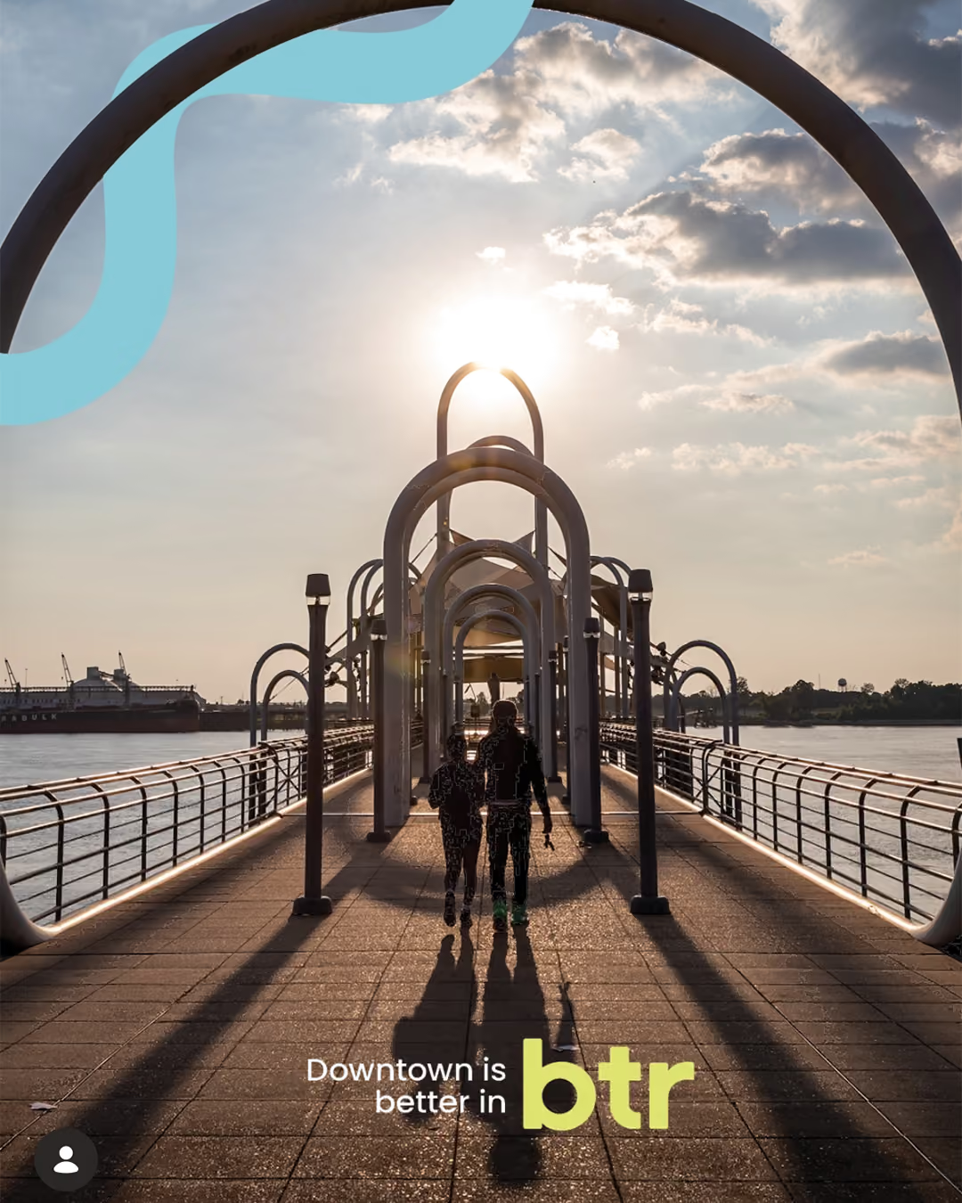
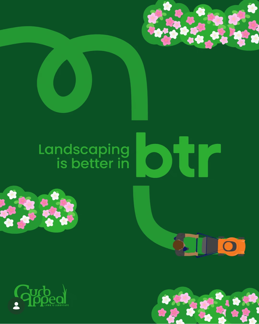
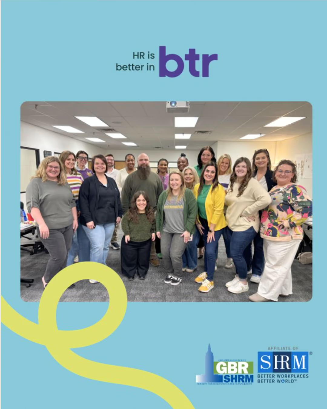
Keep it short. Keep it specific. Keep it you.
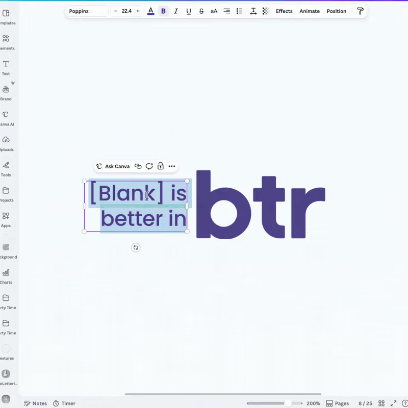
Setting your message
Typeface: Poppins Medium
Alignment: Right Aligned
Tracking: -10
Leading: Set 1 pt larger than the type size
Don’t have Poppins? Arial is an approved alternative
Co-branding
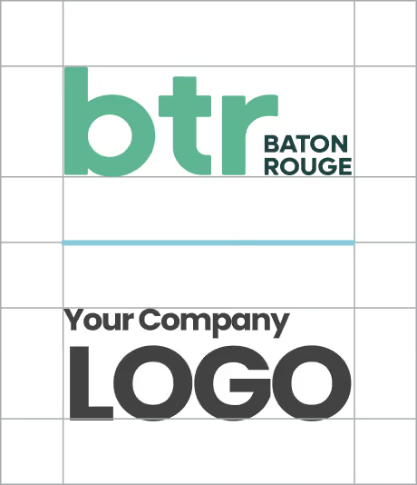
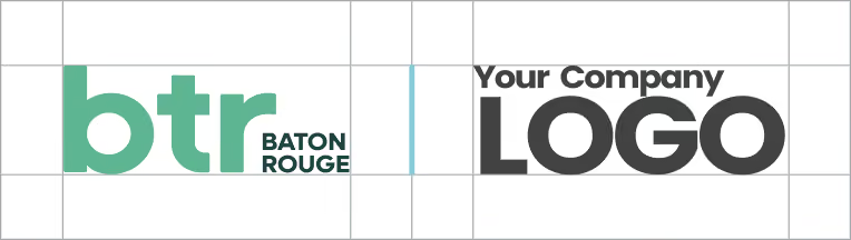
When co-branding any marketing materials, ensure there’s enough space by using the margins and rules indicated. Use the orientation best suited to the application.
Vertical
Horizontal
Multiple Logos

Voice & Messaging
Tell your BTR story.
Need to explain Better in BTR or bring the message into your own marketing? Start here.
In a sentence
In a few sentences
Talking about your involvement
For social media
Find Your Better in BTR Message
Need a little inspiration?
From careers and culture to crawfish and community, there are a lot of ways to tell your BTR story. Explore the Messaging Playbook for ready-to-use ideas, messaging frameworks, and inspiration for making the message your own.